Mobile-friendly simply means that your website is compatible with a range of devices that aren’t desktop or laptop computers. This includes smartphones and tablets, which in themselves cover a wide range of screen sizes and resolutions. These smaller devices, especially smartphones, need a website to be attractive and brand-relevant while being functional and easy to use with one hand, a thumb, or several fingers. Multi-touch technology means that users often have a range of ways they interact with the screen, and your site must make it simple to navigate and interact to cover all bases.
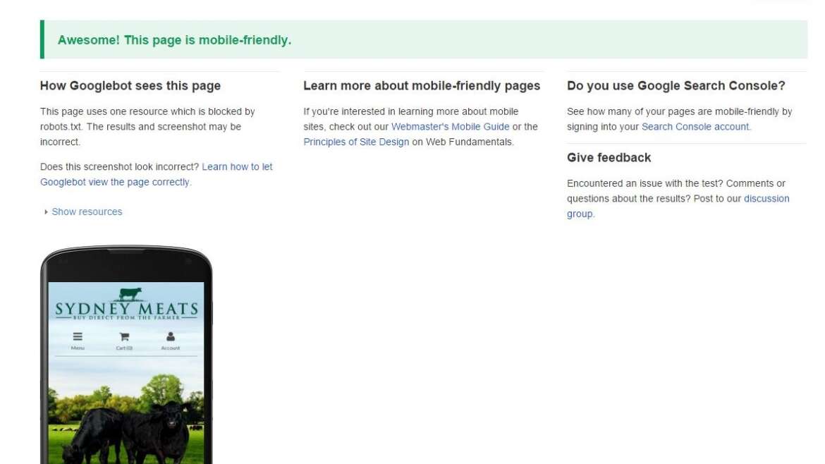
Mobile optimisation is also a major factor in SEO and Google even offers a tool that gives you feedback on the mobile-friendliness of your site.
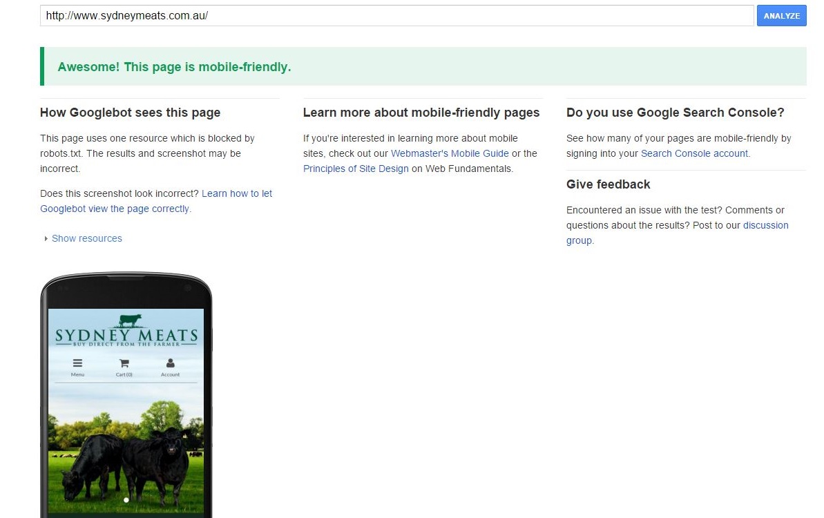
While this is obviously from their specific perspective, their position as the most used search engine and powerful internet influencer makes it a great guide to ensure your site is optimised for smaller devices. Given they also develop and operate the widely used mobile OS, they are able to provide guidelines on how a mobile-friendly website should look, feel and behave.
Types of mobile-friendly websites.
Responsive: This type of mobile site reacts to the browser parameters to change the position and size of the images and HTML elements. The site retains the same content but shuffles it to meet the browser window size. This is the style that generally comes as part of a CMS package.
Dynamic serving: While the URL remains the same, the server sends different coding and design elements depending on the type of device requesting the site. It allows for webmasters to exercise greater control over the loading speed and style of the site when compared to a responsive site.
Separate site: Usually hosted on a sub-domain, such as m.name.com.au, or within a subfolder (www.name.com.au/mobile), this type allows for the desktop and mobile sites to be edited independently. The flipside is that it can create a lot more work as big changes need to be done twice, but it provides the greatest level of control of all three.
The type you choose will depend greatly on the amount of time and money you have to devote to it. Web design is often a trade-off between speed and flexibility, with the faster options offering limited customisation options between the desktop and mobile platforms.
CMS or DIY?
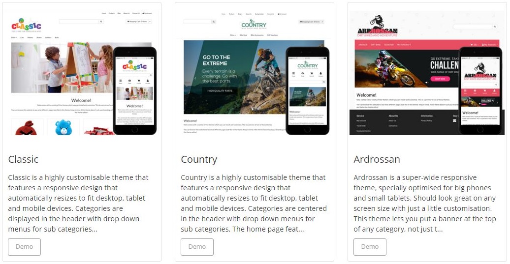
A CMS, such as WordPress, that has responsiveness baked in will provide a fast option that’s ideal for a range of industries. When it comes to eCommerce, a CMS such as Neto provides the perfect way for customers to make purchases, whether at a desktop or on the go. This level of power has little place in the domestic market, but for businesses who want to sell their products online, it is a solution that removes a large amount of the technical knowledge requirements.
The ability to code a site from scratch requires a high-level of technical knowledge and skill, or a big budget. HTML and CSS, like all languages, take time and effort to learn and master before you can see the results you desire. A responsive website as part of a CMS removes these necessities and gives even the least computer literate person the ability to make their website viewable and usable across all devices.
Design elements to make your mobile site the friendliest
A CMS template will have been designed to take care of the majority of responsive factors. However, it is still good to understand what mobile-friendly means on a practical level.
Link spacing: Fingers are less accurate than a mouse cursor. They obscure what they are attempting to select and cover a larger area of the screen as they press down. This means that links need to be spaced adequately to enable people to select the link they want without erroneously touching others in the vicinity.
Image size: An important factor for speed and bandwidth usage, keeping your pictures and graphics optimised will ensure your site loads on a mobile network. Site speed is also an SEO signal, and with mobile becoming an increasingly important ranking factor, a slow mobile site could be damaging to your SERP position, as well as customer patience and ultimately conversion.
Feedback: When using a mouse, users have the ability to hover over a link to see the destination URL. Once they click it, generally it changes colour to show they have requested to navigate to the next page. On a mobile phone or tablet, hovering isn’t possible and without a visual sign that the URL has been clicked, the user may continually try and then give up altogether.
Use buttons: Defining clickable spaces with buttons is the ideal way to guide a user through your mobile site. Make them big and bold, with visual feedback, such as an indentation, to show the user their click has been registered. Zomato’s mobile site is a great example of dividing the screen into clickable areas clearly and simply.

Cut-out text input where possible: Typing on a small phone is time-consuming and the keyboard required obscures most of the screen. Remove the need to enter large amounts text and only use the function when absolutely necessary. Use many pages for forms for ease of use and to protect against errant presses of the Enter key.
Use mobile specific features: Take advantage of click-to-call functionality, maps integration, and a host of other mobile features. Every new model of phone brings new innovations for sites to use and as mobile browsing and shipping continues to grow and develop, fast ways to navigate and engage with a site will become more important.
A vital component in your digital strategy
A mobile-friendly site is no longer a luxury. It is a necessity to ensure your business is making the most of its digital presence. Almost 60% of all internet traffic is now from mobile devices, which is a huge chunk of your audience to lose if you don’t take the time to install a mobile-friendly site. The rise of easy to use CMSs has made it easier than ever before to make the most of your digital marketing budget, without requiring specialist knowledge or expensive web development staff.